The Second Avenue Subway and Property Values
This past Fall, I matriculated at NYU CUSP. I’ve worked on a few cool projects this past semester, and wanted to share a couple of them. This first one is analyzing the impact of the Second Avenue Subway’s opening on real estate prices in Yorkville. Before I begin, I want to give special shout-outs to the best teammates ever, Sarah Schoengold and Hao Xi, who were an integral part of putting this project together!
The Second Avenue line’s impact on real estate prices is interesting for a few reasons. First, East Harlem was just rezoned - in part to prepare for the next extension of the Second Avenue Subway line. By understanding what happened in Yorkville, maybe we can better understand how property values will change in East Harlem. Personally, having lived in the neighborhood (at 116th and Lexington), I know that a new subway line will dramatically improve the area’s accessibility - which will, without a doubt, bring a lot of change. Starting simple by attempting to quantify real estate price changes is a first step to understanding that change.
Second, quantifying the value increase brought about by the subway line is useful for potential value capture strategies for funding infrastructure projects. If the city understands how much money real estate owners will make from proximity to a new subway line, then the city can take a cut of that value increase for itself. Of course, this is only one step toward helping fund new transportation projects - but if something like the Second Avenue Subway could pay for itself, then maybe the Governor could funnel some of that money into the basic maintenance the subway system so desparately needs.
The Data
The data for this project is easily accessible:
- Department of Finance sales data. This dataset records each property sale that happens in NYC, including residential, commercial, etc… - as well as condos, co-ops, and other apartments. We restricted our analysis to residential apartment sales.
- PLUTO. This dataset contains basic geographic and zoning information about each tax lot in the city, among other pieces of information (such as when the building was built, renovated, etc.). We use this to get exactly how far each sold unit was from the subway line.
- Zillow data, to get some meta-information about each property. Sarah put together a Jupyter notebook that scrapes the API for us.
- Some subway GIS data to tie it all together. Hao did this work in ArcGIS, though it wouldn’t be hard to replicate in GeoPandas, my preferred geospatial analysis library.
We had two main issues:
- The DoF sales data is messy. For starters, it’s a bit inconsistent with the way it labels apartment numbers. Additionally, (I think) it includes things like deed transfers, e.g. when someone passes ownership of an apartment on to a family member, as low-valued sales.
- Zillow is not free, and when attempting to pull down information on the apartments we were able to uncover in the DoF data, was inconsistent with what information we could get back.
Working through all this, we were still able to get ~1700 sales records from the past ten years - January 2008 through October 2017. This left us with a dataset of sales with the following baseline features:
- Sale date
- Sale price
- Distance to nearest Second Avenue Subway stop
- Building year built / renovated
- Number of bedrooms in apartment

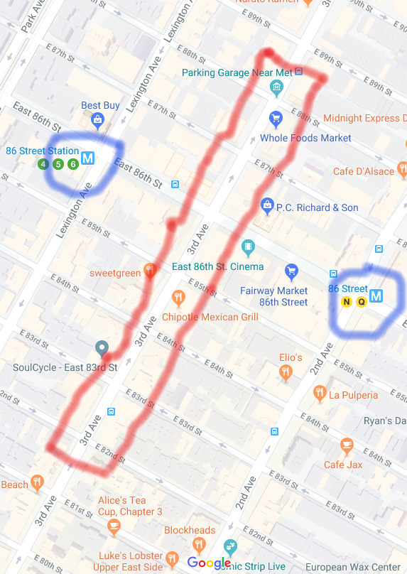
This image shows the area that we'll consider, along with the subway stop locations, and finally, the distance of each lot (where again, lot boundaries are given by PLUTO) to the nearest subway station.
If you want to dive into the data loading and munging, it’s all on github.
The methods: experimental design!
This may have been my favorite aspect of the project. I haven’t spent a ton of time digging through the nuances of experimental designs, so it was fun to learn more. I had exposure to the following, traditional, experimental setup, which we’ll build off of:
- A group of people is partitioned into “treatment” and “control” groups.
- The “treatment” group receives some sort of “intervention” - think, a new drug to lower cholesterol - and some “outcome” is measured - think, cholesterol levels.
- The “control” group does not receive the “intervention”, but they have the same “outcome” measured as for the treatment group. In a drug study, the control group would likely receive a placebo pill and instructions to measure their cholesterol in the same way as the treatment group - the idea being, there is absolutely no difference (in aggregate) between the control group and the treatment group, aside from the fact that the treatment group is taking pills that are specifically designed to lower cholesterol.
- The change in measured outcome is compared between treatment and control group - typically as an aggregated value. In the case of the cholesterol drug, we’d compare the mean cholesterol levels before and after treatment, and see which group experienced a bigger change.
- Because of the way we set up the treatment and control groups to be identical aside from the contents of the pill they are taking, if the treatment group had lower cholesterol, we can conclude that the drug itself had an impact on the treatment group (or did not).
This is pretty much the experimental design you’ll learn in statistics 101 (that’s more-or-less where I first learned about it).
In the social sciences, things are a little different. Setting up an “experiment” around a question like the impact of a subway line on real estate values is tough, because we can’t explicitly control in the traditional sense (as in the drug study example above). We can’t separate out some apartments and deny those units access to the Second Avenue Subway, and then measure how their values are impacted compared to those that do have access. Instead, we have to be a little bit more clever. Our team’s digging came up with a few possible experimental designs.
The initial method: Difference-in-Difference
One of the most popular for this sort of study is a difference-in-differences. The idea with difference-in-differences is we want to set up something as close to an experiment as we possibly can, but with the observational data that we have. Thus, in our case, we’ll pick a “treatment” zone – an area we assume will be affected by the line’s opening, then try to find a “control” zone that has very similar characteristics aside from the fact that the Second Avenue Subway didn’t just open right next to it. Once we’ve done that, we can measure the average sale price before and after, in our treatment and control zones, and compare how big the change was between the two areas.

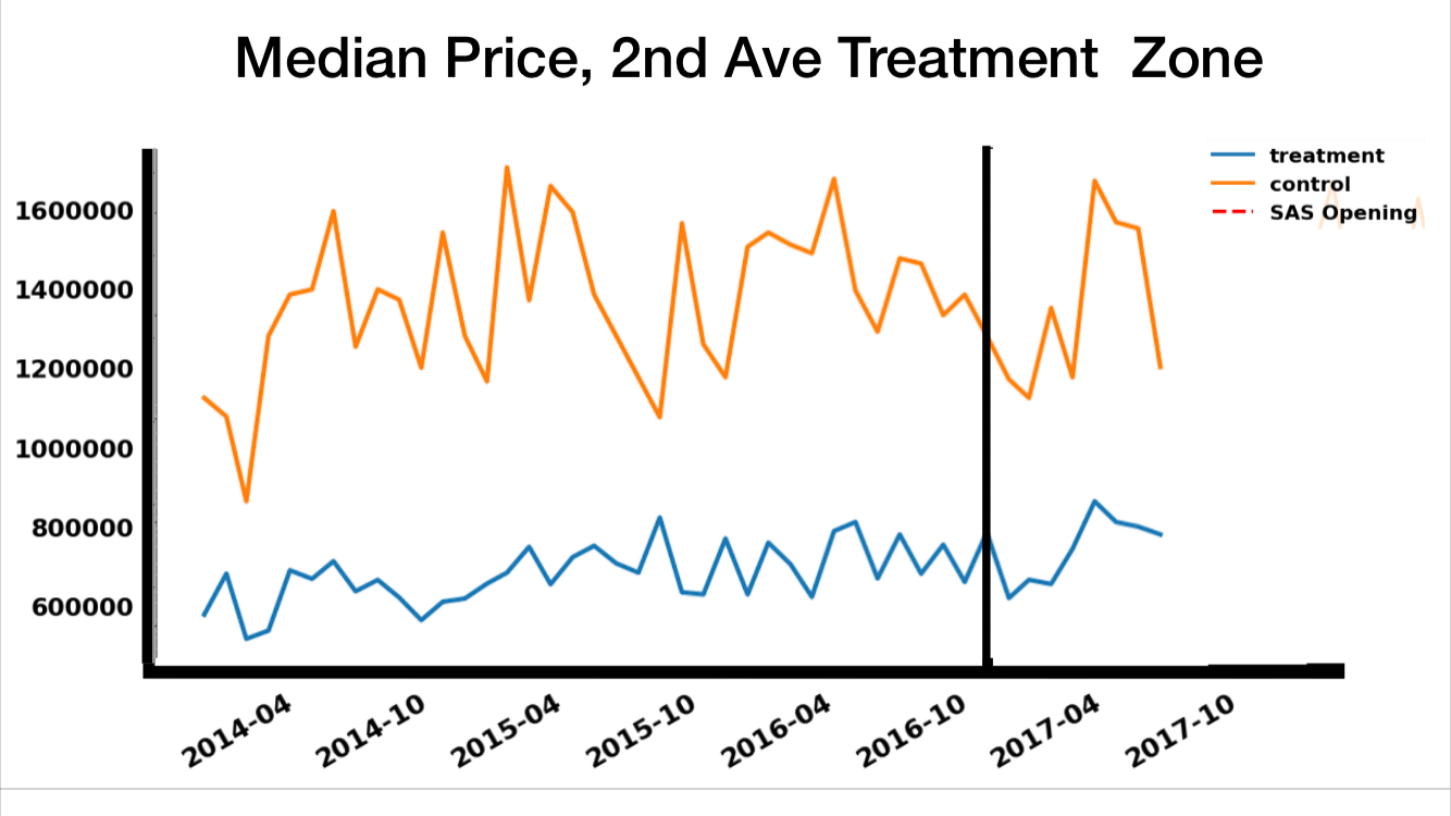
The above images visually explain the Difference-in-Differences setup. In the first, we can see both our choice of study area - roughly speaking, the Upper East Side - as well as our choice of treatment and control areas. Specifically, we consider all buildings east of Second Avenue (the highlighted area) to be members of the treatment zone, while the rest of the Upper East Side (the washed out area) is the “control zone.” By making this choice, we are saying that everything west of Second Avenue is close enough to the 4/5/6 line that its value was not impacted by the opening of the line. This may not be strictly true (e.g. the Second Avenue line is far more pleasant to ride at rush hour, from personal experience, and maybe it will help decrowd the 4/5/6 line), but we suspect it is a safe assumption to make.
In the second image, we compare median prices east of Second Avenue (the blue “treatment” line) to those on the rest of the Upper East Side (orange “control” line). As we can see, the Upper East Side is categorically more expensive than Yorkville, though otherwise prices have varied similarly (albiet at different scales) over time. The black vertical line is January 1, 2017 - the day the Second Avenue line opened. Another way of thinking of this - the experimental way - is that it’s the day our “intervention” actually occurred.
One of the nice things about Difference-in-Difference experiments is that they can be mathematically formulated as linear regressions - I won’t bore you with the details, but this means we can add in other factors to control for things that may differ between the two areas (or otherwise impact price).
Method #2: repeat-sales
Another popular method is repeat-sales. The idea here is that rather than comparing sales and controlling for features that may affect sale price (e.g. apartment square footage), we can just look at the changes in sale price of the same apartment. If we think about this as a regression, where we include factors that control for substantive features, by taking the delta, the substantive features drop out of the equation and we’re just left with time-based changes.
As an example, let’s say we develop a linear model for housing price:
\[price = x \cdot bedrooms + y \cdot bathrooms + z \cdot sale\_year\](caution! this is a bad model for a few reasons, but this is an example)
And then, suppose we use this model to look at the sale of a 2br, 1bath apartment in 2007 and 2010:
\[price_{2007} = x \cdot 2 + y \cdot 1 + z \cdot 2007\] \[price_{2010} = x \cdot 2 + y \cdot 1 + z \cdot 2010\]Now, if we want to look at the change, we could subtract the 2010 price from the 2007 price. Doing so with the model gives us:
\[\delta_{price} = price_{2010} - price_{2007} = x \cdot (2 - 2) + y \cdot (1 - 1) + z \cdot (2010 - 2007)\] \[\delta_{price} = z \cdot (2010 - 2007)\]Because we’re looking at the exact same unit, only time-based features, such as the year in this case, remain in the model of the price growth. This greatly simplifies our assumptions.
In our case, we looked at the “distance improvement to nearest subway” between the two sales. That is, if the first sale in a pair occurred before the line opened and the second sale occurred after, we took a look at how much shorter that apartment’s walking time to the subway was now that the Second Avenue line was open - as compared to their old walk to the 4/5/6 line. Using this method, areas on the far east side of Yorkville will see the greatest price jump, as they have the most dramatic distance improvements.
Looking back to this map, we can actually see the time-based variable we’ll care about in the repeat-sales approach. In particular, we can see a heatmap of how much each property improved its walking distance to the nearest subway when the Second Avenue Subway opened. Red is “most improved” (so as we can see, properties on the far east side of the island gained the most in terms of travel distance improvement). Interestingly, the “green” areas on the map are actually still closer to the nearest 4/5/6 train stop. (Note: ignore the washed out area - even though eveything in it is red, this is not being correctly plotted).

This graph shows the change in distance on the X-axis, compared to the change in sale price on the Y-axis. Many properties in our area of interest experienced a change of 0 with the line’s opening, since they are already closer to the 4/5/6 line. However, there is a clear, though small in magnitude, upward linear trend for those properties which did get a walking distance improvement. We’ll quantify this improvement in our results below.
For the future: regression discontinuity
There’s another interesting design that we didn’t try, but I think may be worth testing: Regression discontinuity. Let’s say that, for the sake of argument, we consider the area around Yorkville (the neighborhood that the Second Avenue Subway opened in) to be quite similar to Yorkville itself. So similar, in fact, that it’s going to be our control area. This experimental design would then look at prices on the margin of the “treatment” vs. “control” groups - for example, homes just west of Second Avenue, if we stick to the treatment/control area we chose. Another interesting break-point might be areas that are just slightly closer to the new Second Avenue line than the 4/5/6, or slightly farther - as the below map illustrates.
 Apologies for the poor drawing.
The Results
Difference-in-Difference
It appears that we have a bit of work to do on the DID model. In particular, similar studies tend to report their models’ performance by their R^2, essentialy the amount of variance in the data explained by the model. Our model had an R^2 of ~.6 while others had far higher R^2 values (close to .8 and even as high as .9). I suspect we may need to further segment the market - for example, maybe we need to control for whether the sold unit is a co-op or a condo. With that said, the DID coefficient of .14 is high - implying that on average, sales east of 2nd Avenue and after January 1, 2017 average about 14% higher than an equivalent sale outside of that treatment zone, holding all other things constant. Wow - that’s a lot!
Something else we tried to do was calculate anticipation effects - basically, understand how much prices would go up in expectance of the line’s opening, rather than the actual opening itself. To do this, we essentially set another “cutoff” point 6 months in advance of the line’s opening to see how much that sales increased before vs. after that point. Unfortunately, due to limitations with the Zillow API, we had trouble doing this - we weren’t able to pull both information on apartments sold right before and right after the line’s opening, so we opted for sales right after the line’s opening.
Repeat-sales
We saw a statistically significant indicator that the SAS has increased property values. In particular, for every 100m of walkability improvement a given unit gained with the SAS opening, its growth factor increased 2% on average. This translates to 8% above-average growth for the units on the far east side of Yorkville, which got a ~400m walkability improvement to the nearest subway. So according to this model, a unit that would have sold for \$400,000 at 86th and York is now worth ~$432,000 … just by virtue of this subway line opening!*
With that said, we had some methodological issues. In theory, with repeat-sales, we should be able to account for the variation to a high degree. A similar study in Montreal reported R^2 values of .7 for a baseline model - ours were significantly lower. I’m not sure why this is - perhaps different sized apartments are fundamentally different markets in New York, and we can’t consider studio apartments in conjunction with 2-bedroom apartments, for example.
* Note that our model is predicting the difference in log prices here - which can also be written as a ratio. So, if a house’s resale price grew $x$ percent, then the ratio of $p_{new} / p_{old} = 1 + (x / 100) $. So, with 8% growth and taking the log, as it turns out, log(1.08) ~ .08. This works more generally with growth factors < 25% (log(1.25) ~ .22) , so we’re fairly safe to approximate here.
The Conclusion
You don’t have to be a real-estate professional to know that the Second Avenue Subway has jacked up values in Yorkville - and you didn’t have to be an industry professional to have guessed that would happen before the line opened. What’s interesting here is that we’ve attempted to quantify exactly how much transit accessibility improves property values - and the answer is that it improves them quite substantially. We can use this information to better fund, plan, and develop new infrastructure around the city, especially as the city begins to develop the next phase of the Second Avenue line’s opening. We hope it may be useful for policymakers to better understand the implications of these infrastructure decisions.
But what about renting?
Something we haven’t looked into, but are very interested in, is rental prices. Do rent increases behave differently than sale price increases? Are there anticipation effects? Do we see rents increase more immediately due to the shorter overall timescale of renting? Unfortunately, rental data is hard to acquire, but given access to the data, we would be very interested in researching this.
Thanks for reading! If you want to learn more, there’s a notebook where all of this analysis is captured.